Page Layout
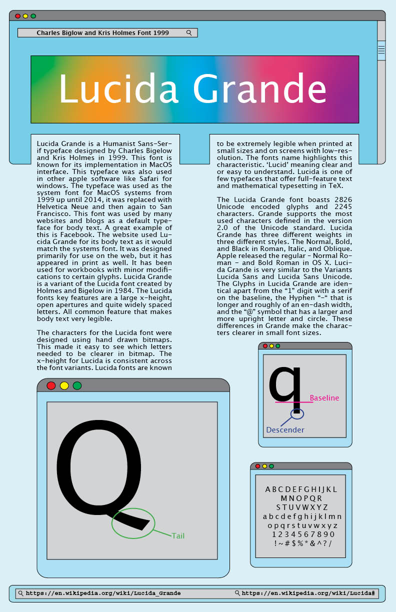
This font poster project was part of our Page Layout course during the first semester of our first year. It was one of the first layouts we created in class. Each student received a font at random. We then researched its history and created a poster based on what we found. I was given Lucida Grande.
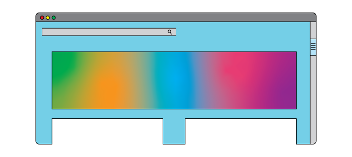
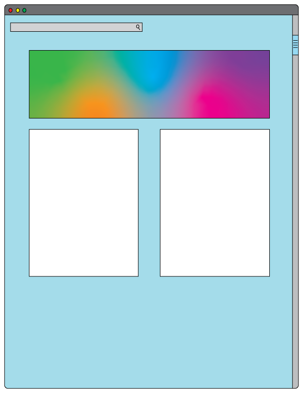
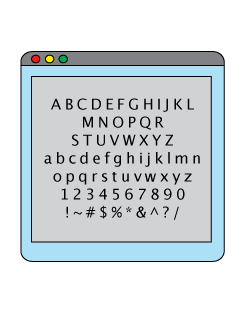
While researching the typeface, I found that Apple used Lucida Grande extensively in its products and interfaces. This gave me the idea to make my poster look like a computer screen. I created several open windows inspired by the look of a MacBook. I wanted the design to connect directly to the history of the font.
Process
I also chose a colour palette inspired by Apple’s early iBooks. When Apple first used Lucida Grande, the iBooks came in bright and playful colours. I used those colours to create a similar feeling in my poster.
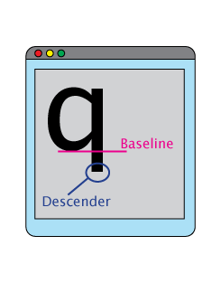
The assignment also required us to showcase the font using a letter of our choice. We had to use the letter to point out specific characteristics of the typeface. I included this information in the different windows on my poster. This helped me meet the assignment requirements while keeping the computer-screen concept consistent.
One of my biggest challenges was fitting everything onto the poster without making it feel crowded. I spent a lot of time adjusting the layout, spacing, and scale of each element. This project was one of my first chances to make my own design choices within a set of requirements. It helped me learn how to balance information, layout, and visual interest.
Check out more of my Print Portfolio here!